Think
about
the box
The PUMA Shoe Boxes that look too good to be true
March 28, 2017The PUMA Shoe Boxes that look too good to be true
March 28, 2017“I am obsessive when it comes to details.”
That could have done the trick for PUMA’s Brand Lead Designer Jan Hippchen, who is responsible for designing PUMA’s shoe boxes, when he snatched away two IF Design Awards for his works: the packaging for the PUMA AutoDisc and the birthday celebration box for the PUMA SUPER ATOM impressed the 58 members of the IF Design jury so much that they bestowed them with two trophies.
“The German industrial designer Dieter Rams once said: ‘Attention to every single detail conveys respect towards the consumer’, so details are important for me when it comes to designing a box,” says Jan. “It’s all about the consumer’s first impression. You shouldn’t judge a book by the cover, but people actually do.”
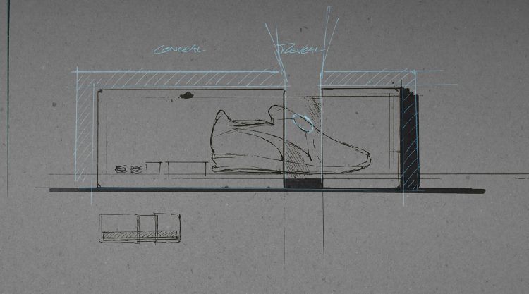
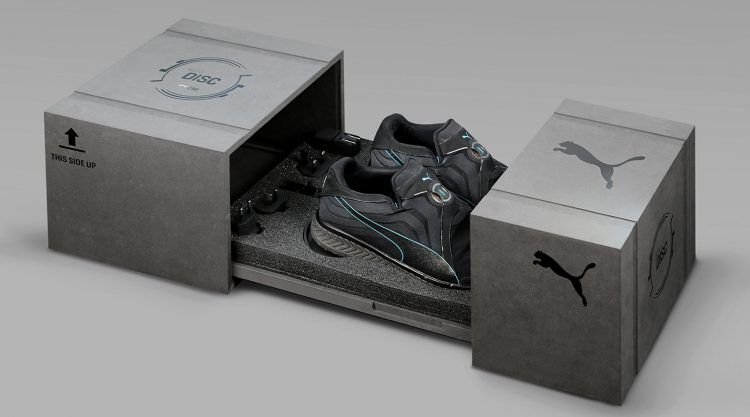
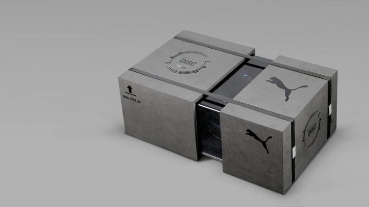
Judging by the box, the PUMA AutoDisc, the first electronic auto-lacing shoe ever, comes across a bit mysterious as the packaging plays with concealing and revealing parts of the content. The black dyed MDF box leaves an acrylic sneak-peek area right on top of shoes. “We wanted to tell the story of mysterious power, but how could a solid packaging tell exactly that? Simply by concealing most of its content but revealing the key tongue-area with the AutoDisc unit through a black tinted translucent window”, explains Jan.
The contrast of raw, protective shipping material is also part of the story. “We were discussing how the shoes can get shipped like a concept car to a big tradeshow somewhere in the world, so I wanted to get this black, stealthy and protective look and feel – even though the boxes turned out to be incredibly heavy”, he says. However, it did the job. The shoes and accessories like a charger and plugs were shipped and arrived safely at 50 selected partners, testimonials, bloggers and tech-geeks to launch the AutoDisc concept.
Sometimes it just needs a simple Idea
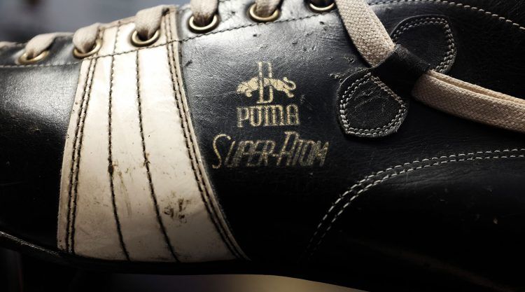
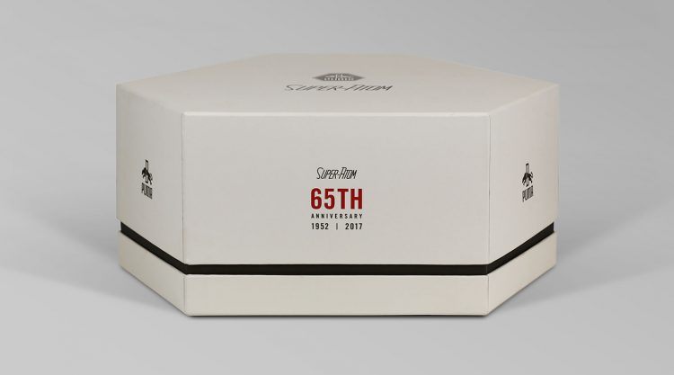
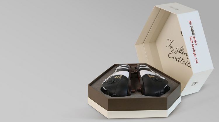
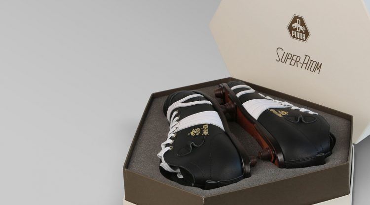
When working on the 65th anniversary box of the PUMA SUPER ATOM, the world’s first boot with screw-in studs of 1952, Jan’s approach was different. “Most important to me here was to stay as close to what we used 65 years ago. That’s why I had a lot of talks with Helmut Fischer, took a lot of photos in his Archive and spent hours and hours on re-illustrating the original graphics.” There was so much beauty and graphic craftsmanship in what Jan found that it was obvious it would not be necessary to create new graphic elements but rather recreate and re-combine what was already there.
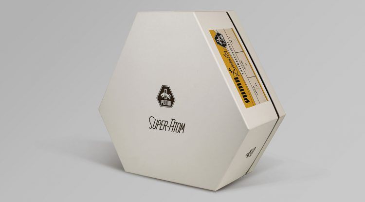
“We also wanted to use the old PUMA Dassler logo from back in the 1950s and realized that this special hexagonal shape is actually a perfect outline around the silhouette of a pair of high-top SUPER ATOMs.”. The outer shape of the packaging was born.
“True, this packaging does look a bit like an oversized praliné box, but like one from the 1950s. Its dimensions, its shape, the off-white and warm gray colors and the refined graphics do not just add value but emphasize the SUPER ATOM’s history and make this edition a real collectible.”
